Form builder add-on
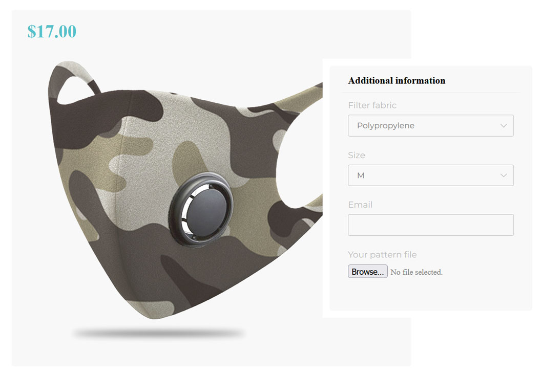
Form builder add-on allows you to add a special form on your configurator to get more information from your customers. You’ll first need to create the form and then add it to a component of your configuration.
/!\ Associated post /!\
1. Create the form
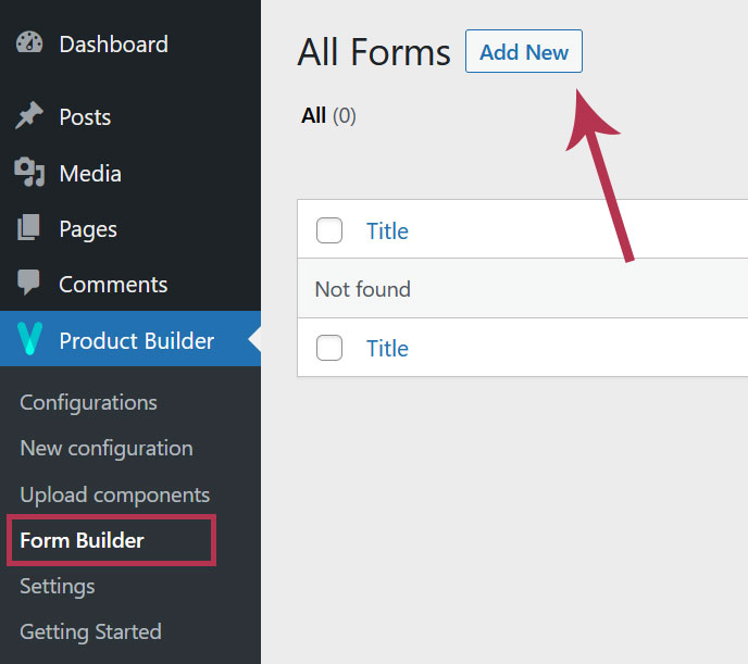
The first step in setting up the add-on is to create the form to display on the configurator page. To do so, go to Dashboard > Product Builder > Form builder and click the “Add new” button.
2. The form fields
On the form creation page, you have the ability to add different types of fields. The available are the following:
- Text: allows the user to enter limited text
- Textarea: allows the user to enter unlimited text
- Radio: allows the user to select only 1 element between others that are displayed as radio buttons
- Checkbox: allows the user to select multiple elements between others that are displayed as checkboxes
- Select: works exactly like the radio type except that the elements are displayed as a dropdown list
- Email: allows the user to enter an email address
- File: allows the user to upload a file (image, document, etc.)
3. The fields settings
All fields have globally the same parameters although some are specific to certain types of fields.
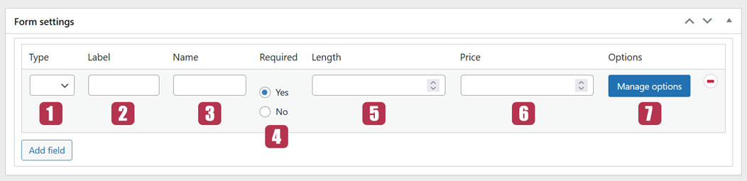
3.1. Type
This is where you can choose the type of field as explained here.
3.2. Label
This is the title of the field that will be shown on the form.
3.3. Name
This setting is particular. It’s used in form processing. Its content is auto-generated when you click the Publish/Update button so you don’t need to fill it.
You can however fill the “Name” field yourself. In this case make sure it’s different for every type of Form fields you add.
3.4. Required
If set to “YES“, this setting makes the field mandatory. If set to “NO“, it doesn’t.
3.5. Length
This setting is specific to the “Text” type. it allows limiting the number of characters the user can enter in the field.
3.6. Price
If the field is filled in on the configurator, the price set here is added to the total price. If the user clears the field, the price is removed from the total price.
3.7. Options
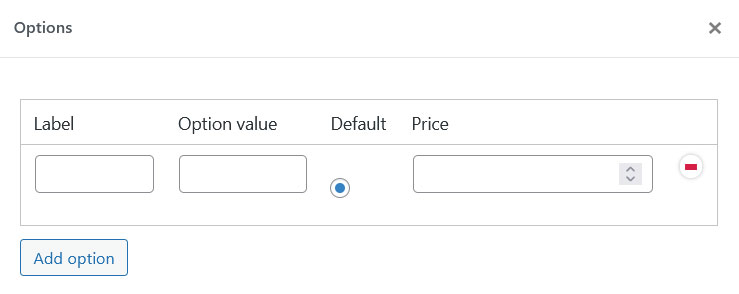
This setting is specific to “Radio“, “Checkbox” and “Select” types. The “Manage options” button opens a pop-up window where you can add the field options from which the user will choose.
The options settings are:
- Label: used for form processing. You can make it the same as the Option value
- Option value: this is the title of the option shown in the form
- Default: makes the option chosen by default in the form
- Price: This is the same setting as here
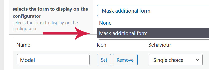
4. Add the form to a configuration
The last step is to add the form to a configuration so that it can appear on the configurator. To do so, edit the configuration and find the “Selects the form to display on the configurator” setting and select the form. It will be displayed below all components on the configurator.
Last updated on May 15, 2023