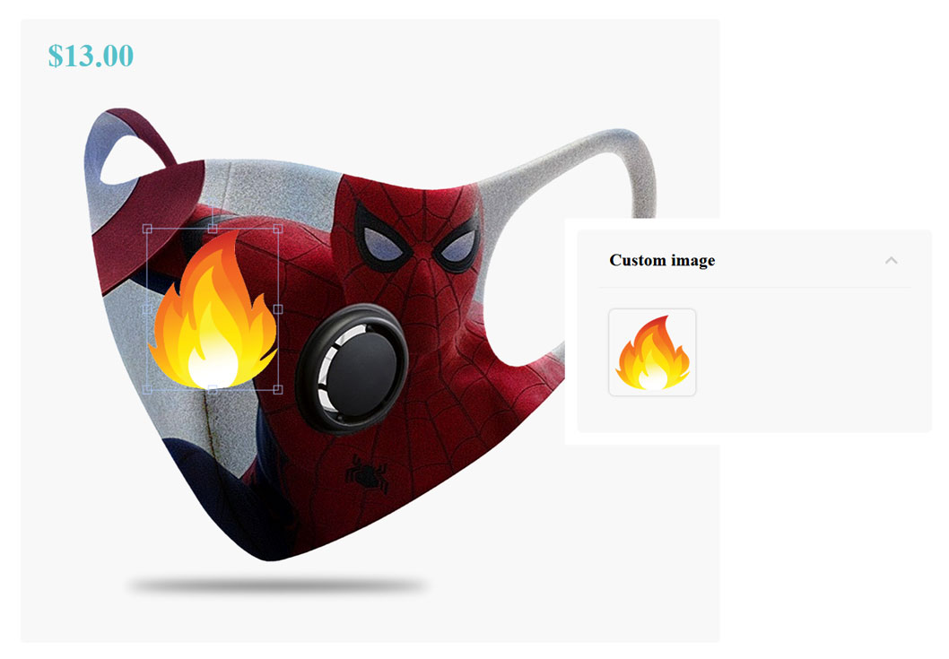
Custom image upload add-on
Custom image upload add-on allows the users to add a personal image to the configurable product. This add-on has a lot of similarities with the Custom text add-on. 2 steps are required to set up the feature: create the image upload component and add it to your configuration.
/!\ Associated posts /!\
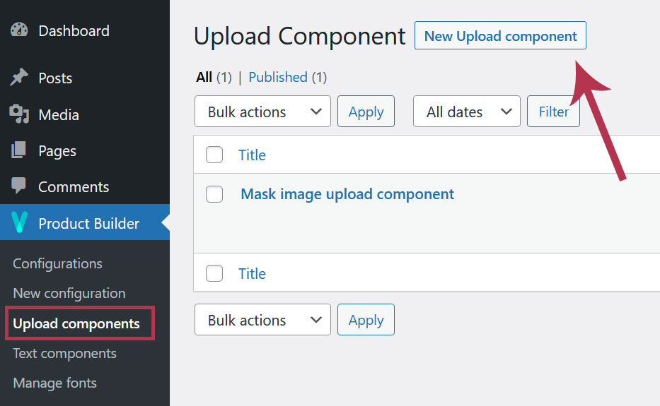
1. Add a new image upload component
The first step in setting up the add-on is to create an upload component. To do so, go to Dashboard > Product Builder > Upload components.
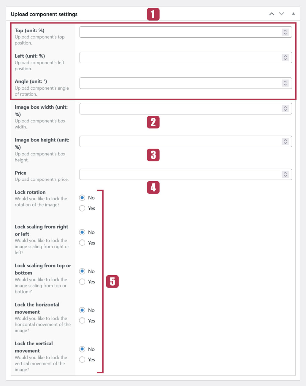
2. Upload component settings
The following shows the upload component settings that are quite similar the the custom text component settings.
2.1. Image position
The settings “Left“, “Top” and “Angle” allow you to define the default position of the image on the preview. They are exactly the same as Custom text position settings.
2.2. Image box width
The default width of the image will have the value defined in this field.
2.3. Image box height
The default height of the image will have the value defined in this field.
Image box width and height are expressed as a percentage of the preview dimensions. So, setting the “Box width” to 25% and the “Box height” to 40% means that it is 25% of the width of the preview and 40% of its height respectively.
In order not to distort the image, since the values you may define are not necessarily those of the image, either the “Width” or the “Height” will only be taken into account to keep the same ratio as the original image.
2.4. Price
If you set a price, when the user uploads an image, this price is automatically added to the total price of the product being configured. If the user removes the image, the text price is subtracted from the total price.
2.5. Image actions settings
Those settings allow or prevent the user to perform certain actions directly on their uploaded image.
If set to “YES“:
- Lock rotation: prevents the user to rotate the image
- Lock scaling from right to left: prevents the user to scale the image horizontally
- Lock scaling from top to bottom: prevents vertical scaling of the image
- Lock the horizontal movement: ensures that the image always stays at the same distance from the left edge of the preview
- Lock the vertical movement: ensures that the image always stays at the same distance from the top edge of the preview
3. Use upload components in a configuration
This is the final part about setting up the Image upload add-on. To do so, edit a configuration and add a new component with the “Upload field behavior“.
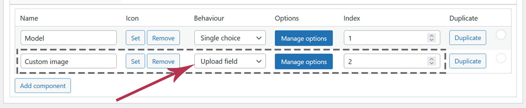
Make sure the “Index” of the upload component is higher than all other components indexes. This ensures that the user will always be able to see their image on the preview.
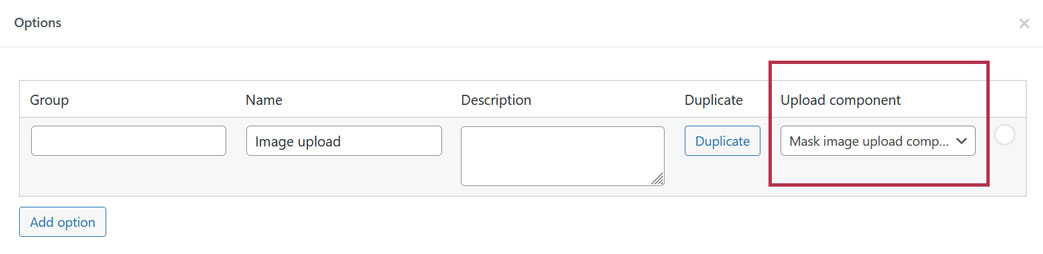
Now, link your text component (created on Dashboard > Product Builder > Upload components) to a configuration option. To do so, click the “Manage options” button, add the option and select the right upload component in the dropdown.
For Image upload add-on to work properly, an option image must always be displayed in the preview. So, make sure to set at least 1 option (with its image set) as “Default” in any component of your configuration.
Last updated on May 15, 2023