Custom text add-on
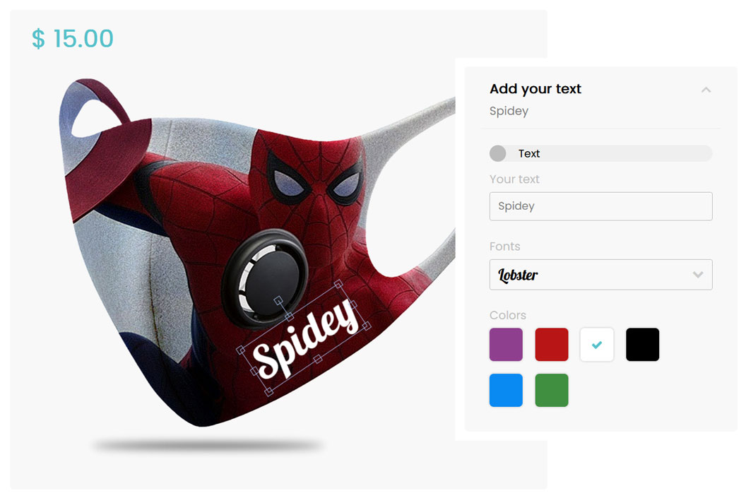
Custom text add-on allows the users to add text to the configurable product. They also can edit the text font, color, and position. 3 steps are required to set up the feature: add new fonts, add new colors, create the text component and add it to your configuration.
/!\ Associated posts /!\
1. Add new fonts
To do so, go to Dashboard > Product Builder > Manage fonts. You’re able to add google fonts or upload your own font file.
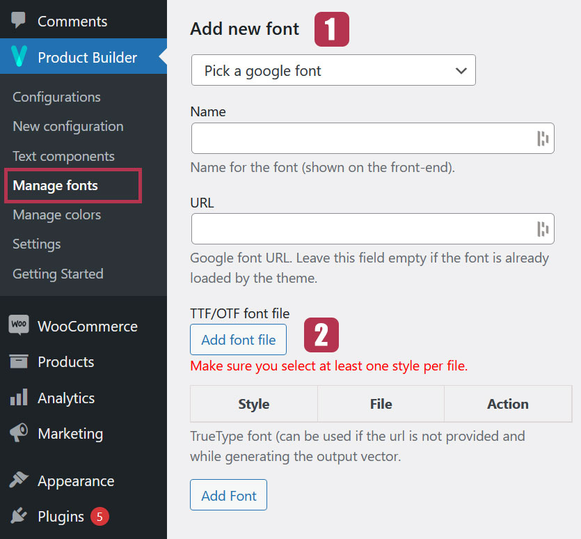
1.1. Google fonts
To add a google font, pick up one in the dropdown list. Once done, the “Name” and “URL” fields will automatically be filled up. Then, hit the “Add font” button.
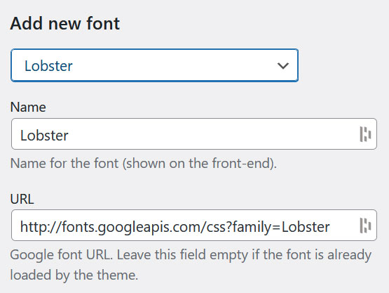
When adding a new Google font, do not change its default name and URL shown in the “Name” and “URL” fields. In case your webisite is already using the font you want to add, clear the “URL” field for not including the same font twice.
1.2. TTF/OTF files upload
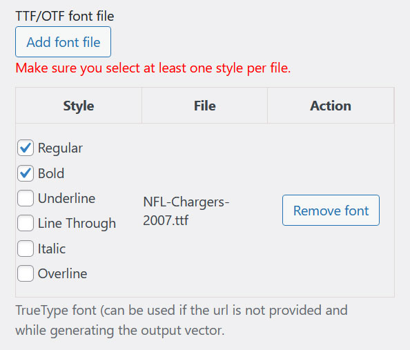
You can also upload fonts from TTF or OTF files. After uploading the files you will have to select at least one “Style” before adding the font.
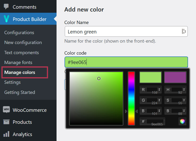
2. Add new colors
To add colors go to Dashboard > Product Builder > Manage colors. You’re able to select the color with a color picker.
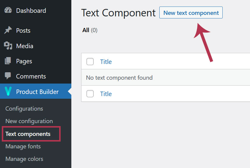
3. Add a new text component
After the fonts and colors, let’s create the text component. To do so, go to Dashboard > Product Builder > Text components and add a new text component.
4. Text component general settings
Those settings are mostly about the text box and its position on the configurator preview.
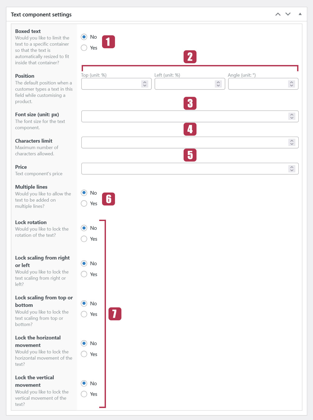
4.1. Boxed text
This setting allows you to define boundaries for the text. If set to “YES“, you will be prompted to define the dimensions of the text area in which the text will be confined.
The text box dimensions are expressed as a percentage of the preview dimensions. So, setting the “Box width” to 10% and the “Box height” to 15% means that it is 10% of the width of the preview and 15% of its height respectively.
4.2. Position
The position setting allows you to define a default position for the text.
- “Top” for the distance from the top edge of the preview
- “Left” for the distance from the left edge of the preview
- “Angle” for the rotation degrees of the text
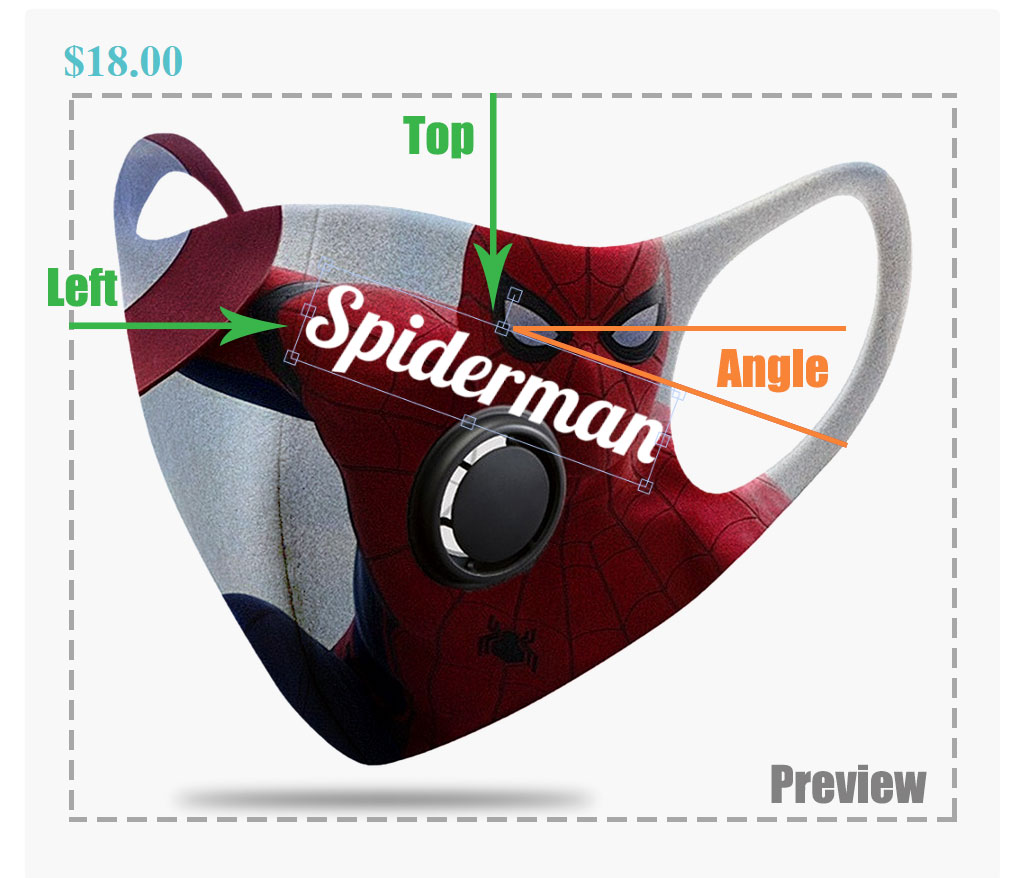
Distances are expressed as a percentage of the preview dimensions. For example, setting the “Left” position to 10% and the “Top” position to 20% means that it is 10% of the width of the preview and 20% of its height respectively.
4.3. Font size
It sets the default font size of the text when shown on the preview
4.4. Characters limits
With this setting, you can define the number of characters the user can type.
4.5. Price
If you set a price for the text, when the user types a text, this price is automatically added to the total price of the product being configured. If the user removes the text, the text price is subtracted from the total price.
4.6. Multiple lines
Longer texts can be written in several lines. If set to “YES“, this setting will allow line breaks in the text field so that the text can be shown in multiple lines.
4.7. Text actions settings
Those settings allow or prevent the user to perform certain actions directly on the text that is shown on the preview.
If set to “YES“:
- Lock rotation: prevents the user to rotate the text
- Lock scaling from right to left: prevents the user to scale the text horizontally
- Lock scaling from top to bottom: prevents vertical scaling
- Lock the horizontal movement: ensures that the text always stays at the same distance from the left edge of the preview
- Lock the vertical movement: ensures that the text always stays at the same distance from the top edge of the preview
5. Fonts settings
This setting allows you to choose whether to show a font dropdown to the user so that they can change the text font on the preview.
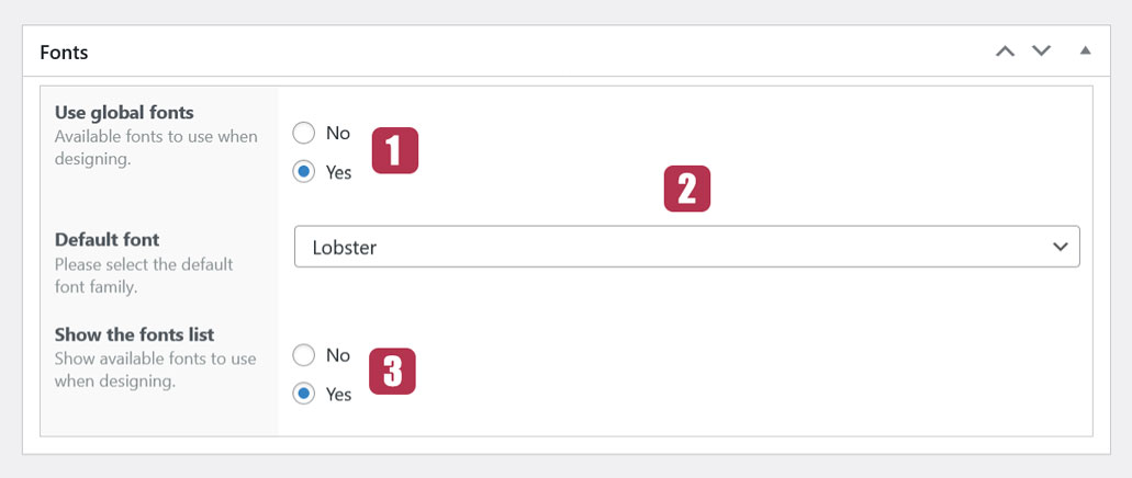
5.1. Use global fonts
If set to “YES“, all created fonts will be listed in a dropdown on the configurator. if set to “NO“, it means you don’t want to show all the fonts for this text component. You then will be prompted to choose the fonts to display in the “Selected fonts” field.
5.2. Default font
This is the default font assigned to the text when the user types it.
5.3. Show the fonts list
If set to “NO“, the fonts list won’t be shown to the user. In this case, they won’t be able to change the font. If set to “YES“, they will be able to change the text font in a dropdown.
6. Colors settings
This setting allows you to choose whether to show the text colors to the user so that they can change the text color on the preview.
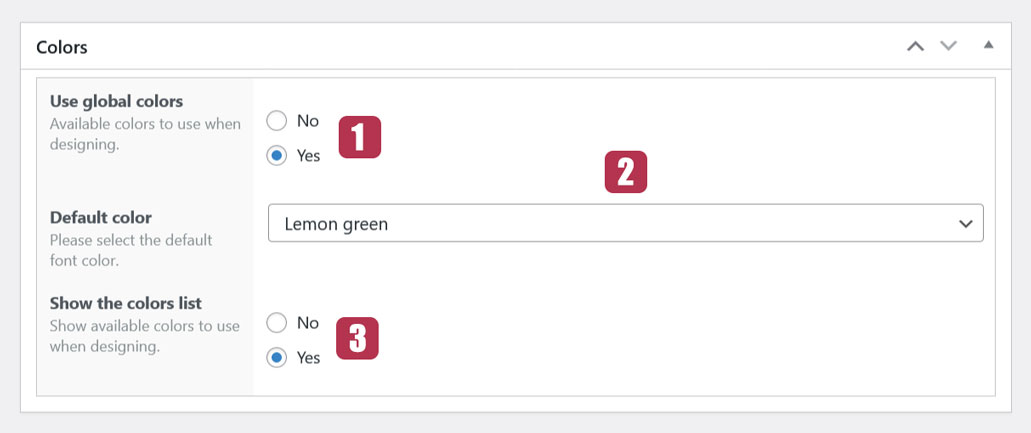
6.1. Use global colors
If set to “NO“, it means you don’t want to display all the colors for this text component. You then will be prompted to choose the colors to display in the “Selected colors” field. On the other hand, If it is set to “YES“, all defined colors will be listed on the configurator.
6.2. Default color
This is the default color assigned to the text when the user types it.
6.3. Show the colors list
If set to “NO“, the defined colors won’t be shown to the user. So, they won’t be able to change the text color. If set to “YES“, they will be able to change the text color.
7. Use text components in a configuration
This is the final part about setting up the custom text addon. Now that the text component is created, you need to associate it with an option in a configuration. To do so, edit a configuration and add a new component with the “Text field behavior“.
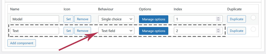
Make sure the “Index” of the text component is higher than all other components indexes. This ensures that the user will always be able to see their text on the preview.
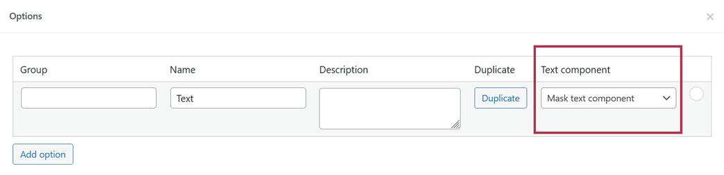
Now, associate your text component (created on Dashboard > Product Builder > Text components) with a configuration option. To do so, click the “Manage options” button, add the option and select the right text component in the dropdown.
For Custom text add-on to work properly, an option image must always be displayed in the preview. So, make sure to set at least 1 option (with its image set) as “Default” in any component of your configuration.
Last updated on May 15, 2023