Configuration settings
This article will show you how to create a configuration. Configurations are the most important part of a configurable product. This is also the part that requires the most work when creating the configurable product, yet easy to understand.
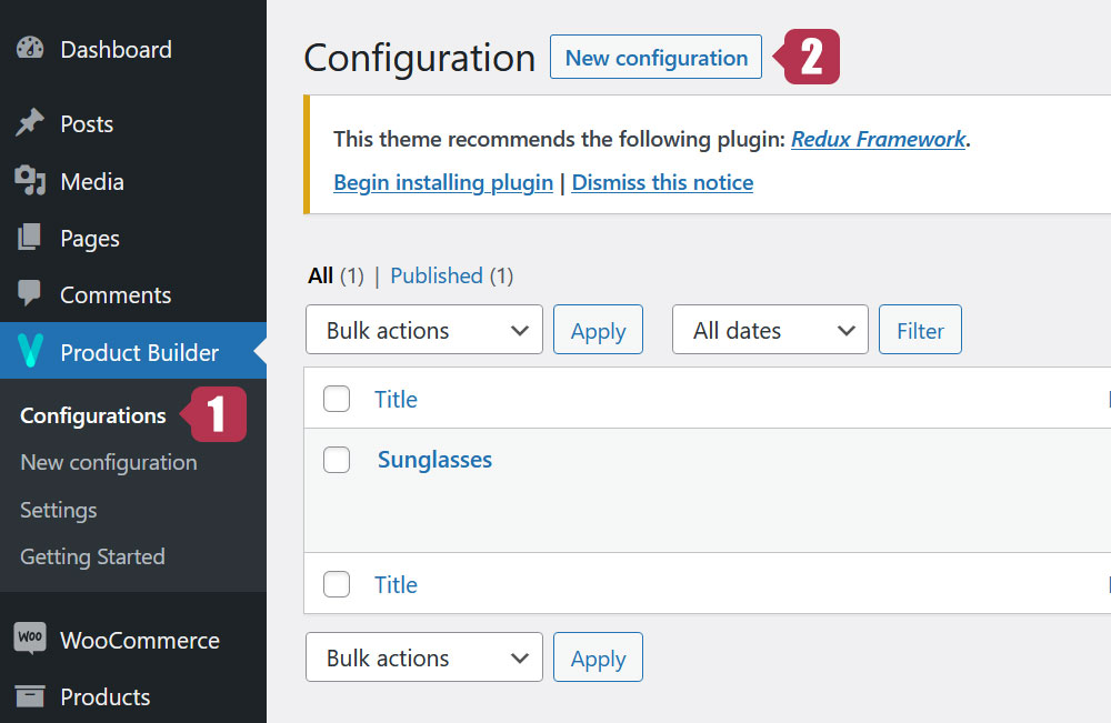
1. Add a new configuration
To add a new configuration, go to Dashboard > Product Builder > Configurations > New configuration
2. General settings
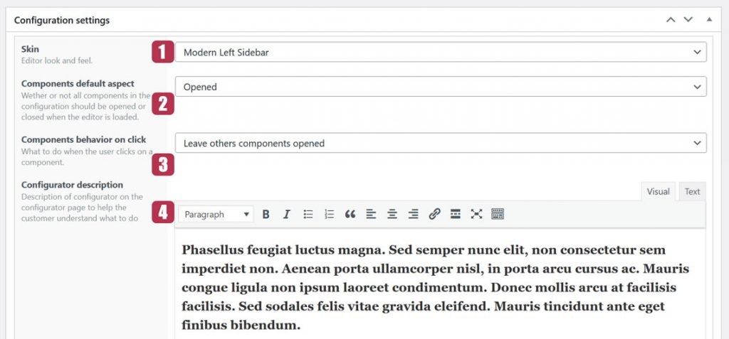
2.1. The Skin
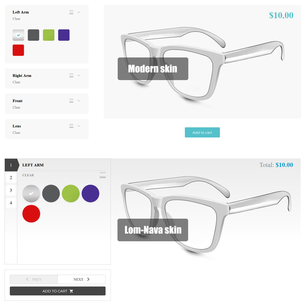
The skin is basically the general look of your configurator. Visual Product Configurator comes with several skins including a default and a free one. Here are 2 of our most popular skins.
We offer skin customization services. You can have your own, designed according to your taste. Contact us to know more.
2.2. Components default aspect
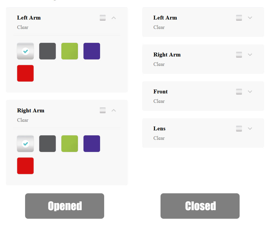
This setting contains 2 parameters: Opened and Closed. If “Opened” is chosen, All the components will be open when the configurator loads, revealing all options. If on the other hand “Closed” is chosen, all the components will stay closed.
This setting is not compatible with all skins.
2.3. Components behaviour on click
This setting contains 2 parameters: Leave other components opened and Close other components. If “Leave others components opened” is chosen, when clicking on a closed component, it will open and will close when clicking a second time on it. If “Close others components” is chosen, when clicking on a closed component, it will open while the other components will automatically close.
Like the previous one, This setting is not compatible with all skins.
2.4. Configurator description
This setting allows you to put text or HTML content before the configurator.
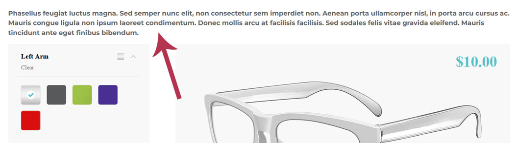
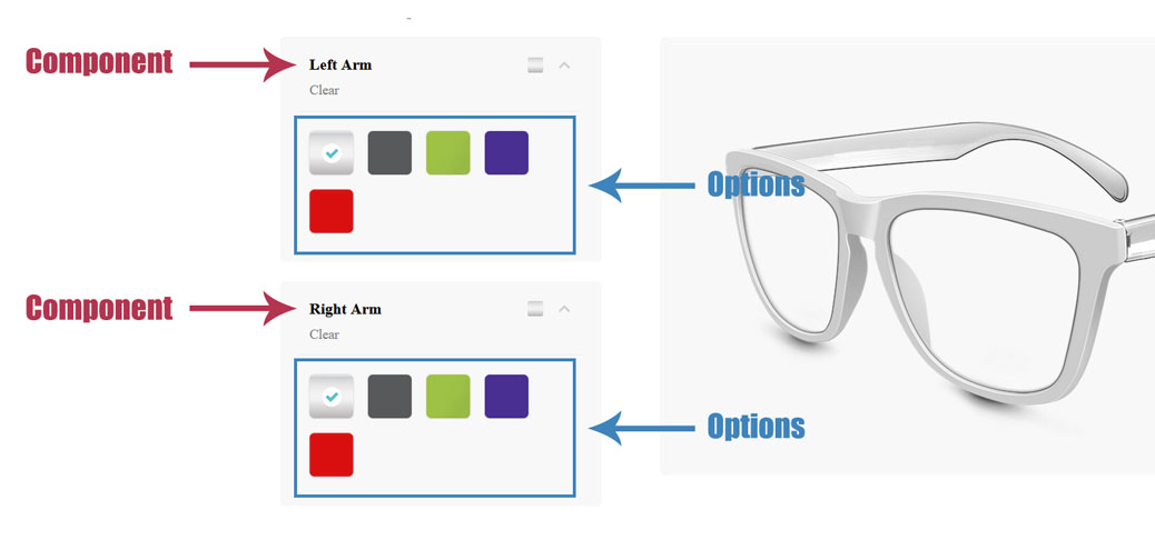
3. Components and options
The components are the configurable parts of your product while the options are all the variations of these parts.
3.1. Components settings
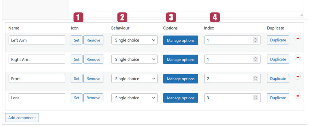
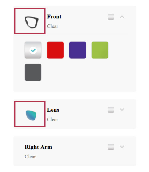
3.1.1. Icon
The icon is an image representing the component.
3.1.2. Behavior
There are 3 options available here: Single choice, Multiple choices and Dropdown.
- Single choice: Allows only one selection among the component options
- Multiple choices: Allows multiple selections among the component options
- Dropdown: Make the option appear as a dropdown list and allows only one selection
3.1.3. Manage option button
This button will open the options settings window related to each component.
3.1.4. Index
The index feature is related to the Layering system. It’s a way to organize the components layers during the merging. A component with a higher index will have its layer placed on top of the others.
Last updated on May 11, 2023